top of page
PLANNING, PRODUCTION AND PRESENTATION
Initial ideas- Feb ‘21
I D E A S

Idea for Final Major Project- 15/03/21

INITIAL EXPERIMENTS:
EXPLORING HYPERREALISM


FACE MASKS
I have chosen to explore my theme purely through the use of tonal pencil drawings, limiting my colour palette simply down to black and white. I have chosen to do this as I feel I can more effectively produce highly detailed drawings through this medium and technique.
Tonal pencil drawing

(21/04/21)
PHOTOSHOOT ONE
Initial experimental photoshoot exploring the concept of lockdown and isolation- focusing on the symbolism of face masks.
- health care, protection of others
-symbolism of pandemic, COVID
-freedom of speech
-hiding emotion
-impact communication of facial expressions
Sketchbook:


Biro drawing
Photo edits:


Drawing from photos:
Experimenting with alternative background surfaces and size
A3 Drawings
White paper

Grey paper- artis reference; ray coffey


Cream paper
(09/03/21)
(23/03/21)
(19/03/21)
(26/03/21)
A4 Drawings
My aim when producing these drawings was to focus on the details of the hair and being able to achieve a greater sense of realism. I feel drawing hair is my greatest weakness within my portraits which is why I wanted to focus my attention of practising this through these experiments.
(With border)
(02/04/21)

(Without border)
(02/04/21)

My initial photoshoot conducted consisted of an individual wearing a surgical mask against a white background. I was inspired from my research into the Tates’ ‘Making Art in Isolation’ and began to question the symbolism behind a mask. I produced a series of experiments exploring the idea of hyperrealistic portrait drawings on various coloured papers (white, cream and grey). From these experiments, I found the most effective to be the portraits on white paper with a border. The cartridge paper allowed me to achieve greater amounts of detail. Although the drawings of a face mask appeared more on the grey which I really liked, I found it easier to gain more realistic drawings on the alternative coloured paper. From these studies, my main intention is to improve and practise drawing hair as I feel its my greatest weakness within these portraits. To develop further, I intend on exploring this same style on a larger scale and to explore if the impact of lighting plays an influence on the impact these portraits create.


PHOTOSHOOT TWO
Experimental photoshoot exploring the concept of lockdown and isolation. Exploring the influence of light and dark on the atmosphere created and whether it influences the psychological impact.
(23/03/21)
Photo edits:


1/6
For this photoshoot, my main intention was to explore the concept of chiaroscuro to determine how light and dark influences the psychological impact. Following on from the same idea of incorporating a face mask, I aimed to create a greater feeling of isolation by isolating a figure amidst darkness. I experimented with alternative angles of the figure and light to produce the most effective images to edit and work from.
Editing process:


Working from my photos
Graphite
(31/03/21)

Black paper EXPERIMENTS
(02/04/21)


EVALUATION OF PHOTOSHOOT TWO:
My main intention for this shoot was to collect images exploring the impact on lighting and whether this influence the impact created. By isolating a figure in darkness, in my opinion, expressed the concept of isolation far more effectively than my original photoshoot. However working from these images were a lot more difficult than those in photoshoot one. I particularly like the high contrast produced in the graphite drawing yet it was far more difficult to achieve the high level of detail I would like and far more time consuming.
My experiments on black paper were extremely unsuccessful. It was difficult to achieve a smooth finish and detail within the portrait as well as accurate proportions of the face.
IDEAS FOR DEVELOPMENT

SIZE?
Experimenting with a larger scale:
A2 pencil drawing
(11/04/21-14/04/21)
PHOTO REFERENCE:


PROGRESS:

11/04/21

11/04/21

14/04/21
11/04/21
1/10
I wanted to experiment with a larger scale drawing following the same ideas from my initial experiments based off photoshoot one. From doing so, I much prefer the drawings of a bigger size as I am able to achieve greater amounts of detail than the smaller A3 and 4 drawings, I was able to see whether or not I would be able to achieve more A2 drawings in the time frame left or consider a larger size.
OUTCOME:

COMPARING SIZE and colour
COMPARING A2, A3 AND A4
WHAT’S THE MOST EFFECTIVE IN PRESENTING IDEA ACROSS?
TIME SCALE- IS IT ACHIEVABLE?
WHAT IS THE MOST EFFECTIVE BACKGROUND/PAPER COLOUR?
(14/04/21)

- prefer larger scale drawing- could go bigger (A1)
-white paper most effective- can achieve most amounts of detail
-prefer with border
VIRTUAL EXHIBITION
INITIAL EXPERIMENTATION
(20/04/21)
USING KUNSTMATRIX AND FLOOR PLANNING
Exhibition experiment one
Images from previous experiments
Size of drawings on wall- 4.5ft x 6ft


floor plan
Virtual exhibition
NOTES:
-size of drawings- ability to enlarge as much as possible- what’s going to have the most effect?
-used drawings from experiments- need to consider if put borders or not??
-used both websites- prefer Kunstmatrix over floor planner.
-how to develop further? Size? Colour? Layout? Room?
-floor planner- could design own space- create space to reflect isolation, dark, more compact?- think about impact??? Quite complicated and longer to do.
-how many on each wall?
FURTHER EXPERIMENTS:
THINGS TO CONSIDER:
what is the most effective?
SIZE OF DRAWING


Size of drawings on wall- (6ft x 10ft) compared to (4.5ft x 6ft)
WALL COLOUR


Dark grey- most effective
TYPE OF ROOM AND LAYOUT


COMPOSITION IDEAS


Exploring variations of room layouts which I could use as part of my final exhibition
Room designs:
From placing my drawings in an exhibition, it has altered my perspective on placing my work in a space and the size of the image. By producing a virtual exhibition, I am able to enlarge my drawings to a greater scale than the originals which I feel produces a greater impact. I would like to adapt this when thinking about my final outcome. I intend on creating a space, adapting the strengths from these experiments, to produce an exhibition. The majority of my drawing experiments have been of the same people therefore to move forward I intend on produce it a series of smaller scale drawings of a greater variety of people which I can enlarger. In my opinion, the most effective room was from my initial exhibition experiment. I intend on using the same layout but altering the wall colour to dark grey as it produces a greater contrast between the wall and the portraits.
FINAL OUTCOME
IDEAS AND PLANNING
(23/04/21)
Larger scale drawings and working toward a final virtual exhibition


PHOTOs
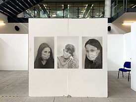
I have collected a series of photos following the same idea used within photoshoot one which I aim to use to produce my final drawings. I aimed to collect a wider variety of people, of different ages and genders, to put into an exhibition.


FINAL PHOTOSHOOT
As part of my final outcome I aim to produce a large scale drawing. Following my method and idea of photoshoot one of an individual against a white background, I have collected more images exploring the body language and gaze of an individual in a face mask to help demonstrate my concept of my FMP.
(25/04/21)
CONTACT SHEET:


EDITING PROCESS:


EDITS:


1/9
A4 DRAWINGS
From experimenting with Kunstmatrix, I would like to produce a final exhibition to present my work. I wanted to produce an exhibition that showed a greater variety of individuals rather than just the same two people I conducted my initial experiments on. Following the methods used within photoshoot one, I aim to produce A4 drawings which I will be able to enlarge in an exhibition space.

(02/04/21)- from experiments

(3/05/21)

(3/05/21)

(27/04/21)

(28/04/21)

(29/04/21)

(30/04/21)

(27/04/21)

(26/04/21)
Grey Background
(3/05/21)

White Background

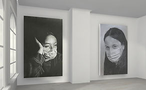
From comparing the drawings against a white and grey background, I feel they are more effective on the grey, specifically due to the use of a white border. I intend to adapt this to my final exhibition when considering wall colour.

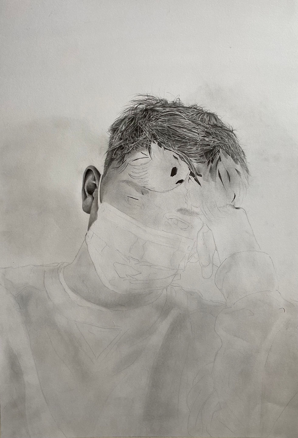
A1 DRAWING
PROGRESSION AND PRODUCTION
From experimenting on Kunstmatrix and being able to enlarge my drawings into an exhibition space, it has altered my perspective of having my work on a wall and scale of my work. I particularly like how they have turned out on a larger scale. I would like to produce an A1 drawing following the same techniques of my previous smaller scale portraits.
PHOTO REFERENCE:
PROGRESSION PHOTOS:


28/04/21
03/05/21

14/05/21
28/04/21
1/9
PRODUCTION:


FINAL OUTCOME
(14/05/21)


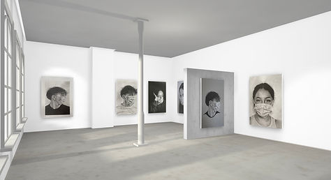
VIRTUAL EXHIBITION
(3/05/21)
As part of my final outcome, I wanted to exhibit my work in a virtual exhibition. This allowed me to enlarge my drawings to a greater scale from the original A4 portraits. I chose to use Kunstmatrix to produce the space, adapting my experiments exploring size and wall colour, to curate the final exhibition.


PLANNING FOR EXHIBITION SPACE
(25/05/21)

8ft (96”)
<
>
<
57”- 60” (eye level) Standard height for midpoint of image in a gallery
8ft
>
INITIAL LAYOUT IDEAS
DIGITAL PLANNING: EXPLORING IDEAS
(Not to scale)
Need to consider size of images when printed or when printing (will appear different to plans)
Placement on wall- standard height: 57 to 60 inches (eye level)

One large drawing & series of smaller drawings

Four Images
Three images

Two large drawings- need to decide on what images and slightly higher positioning on the wall


Incorporating work from previous projects
Series of drawings- could select 9 alternative images
bottom of page